We pledge allegiance to bold flavor, and bold design.
United Sodas of America Rebrand Spring 2025
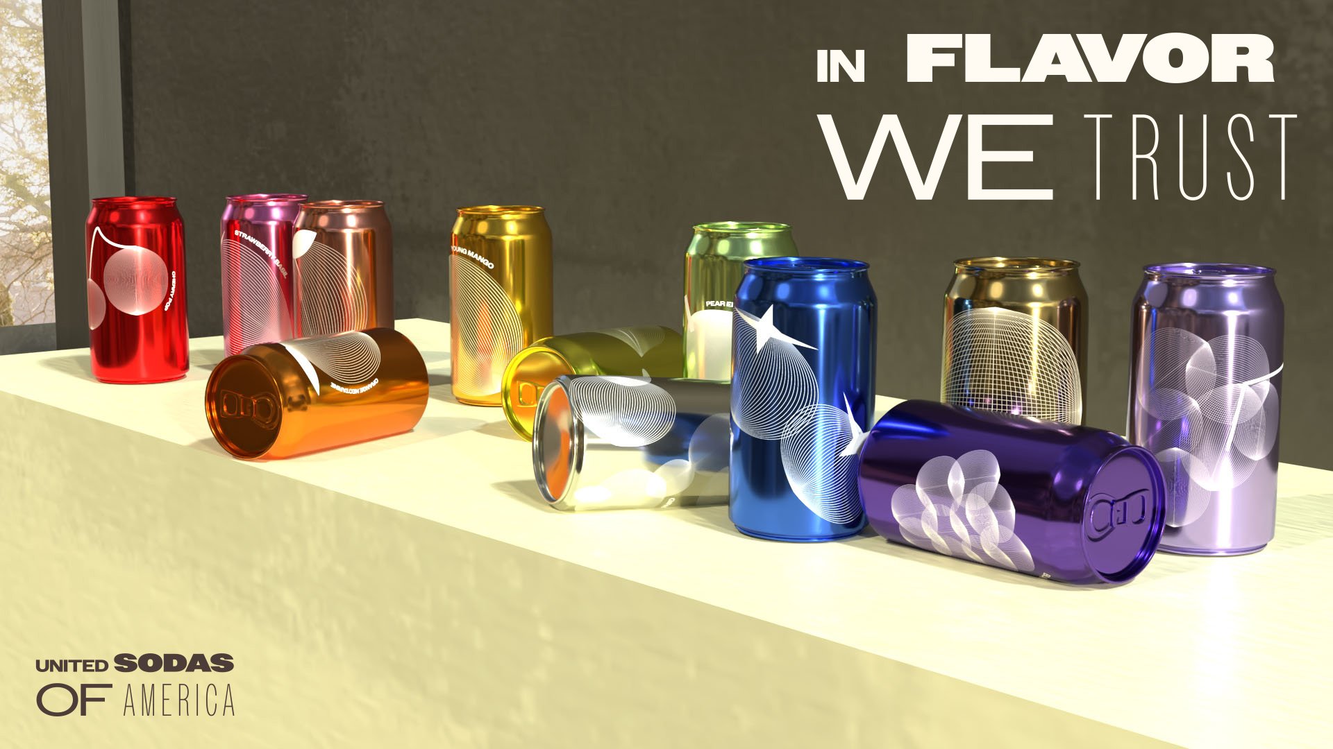
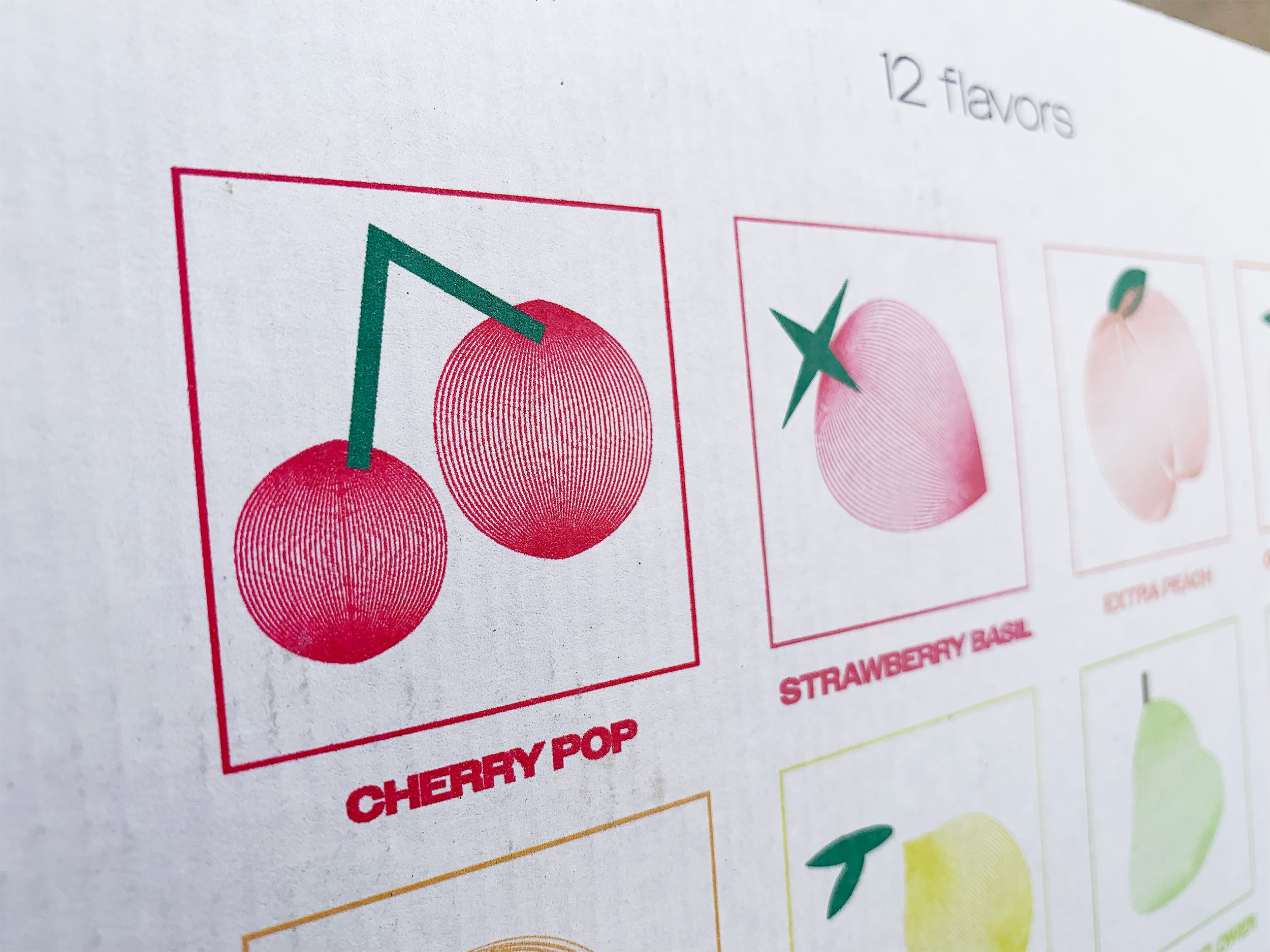
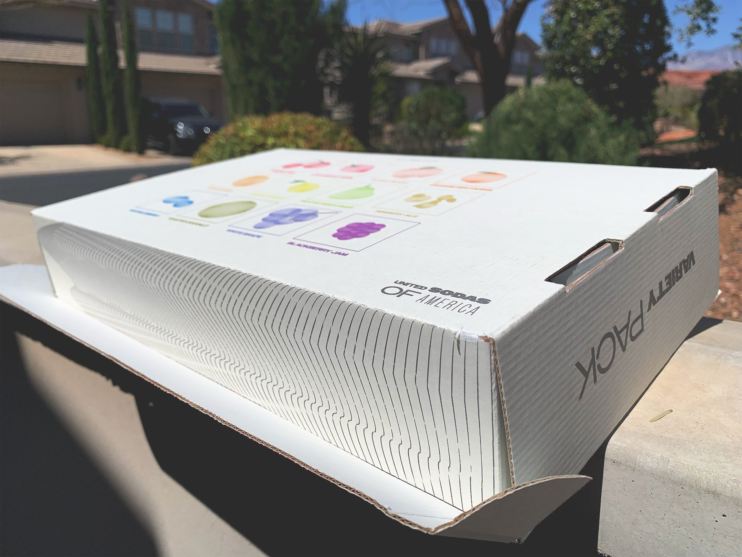
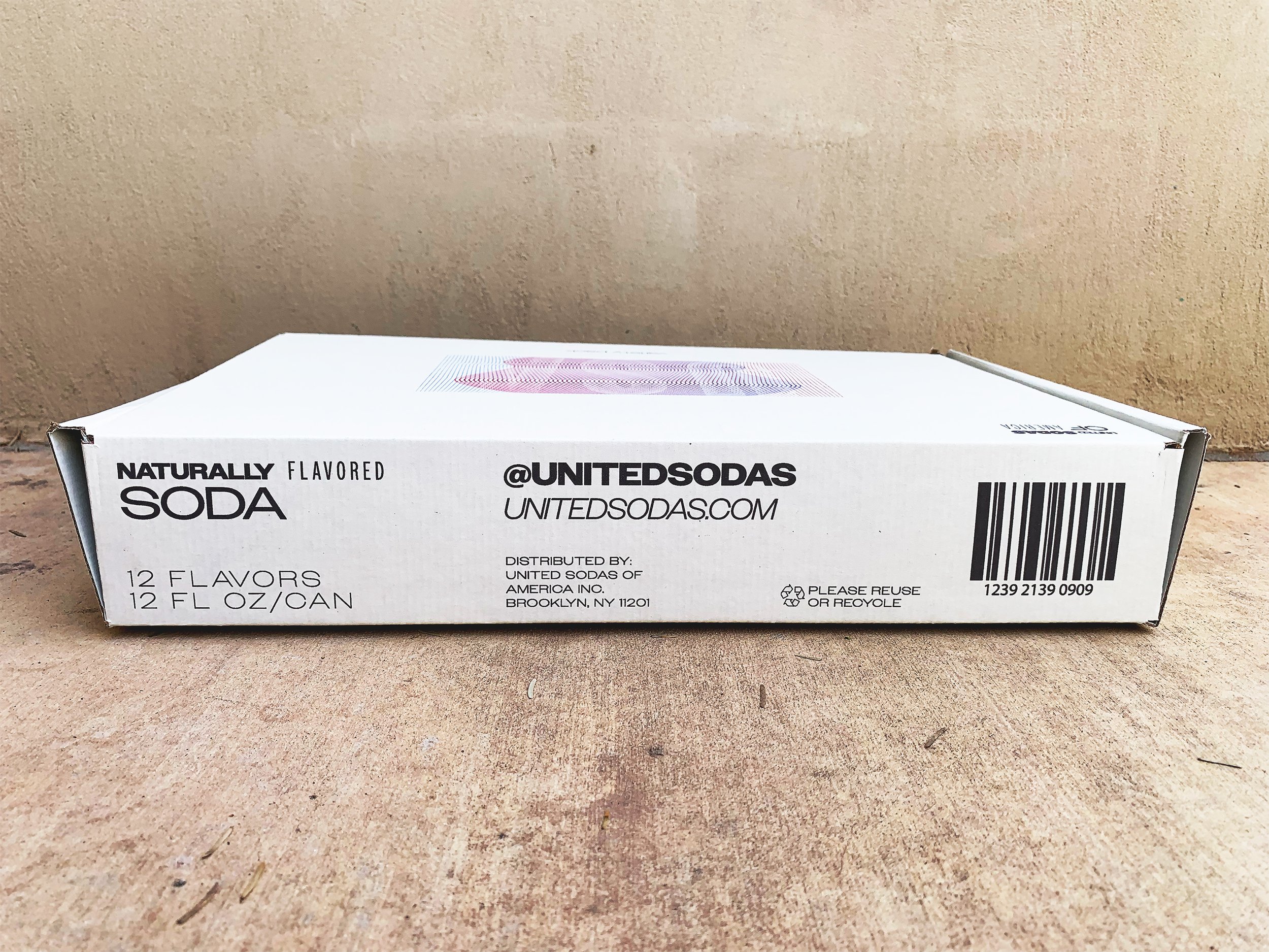
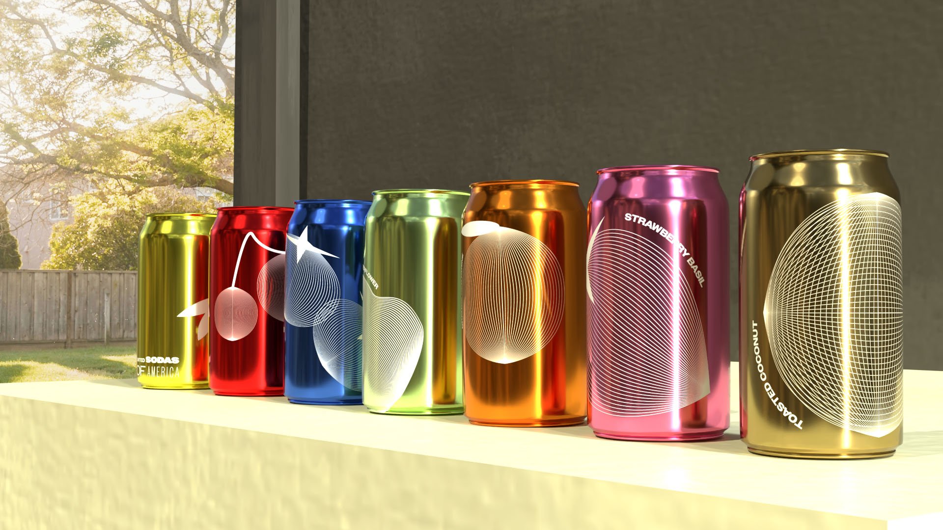
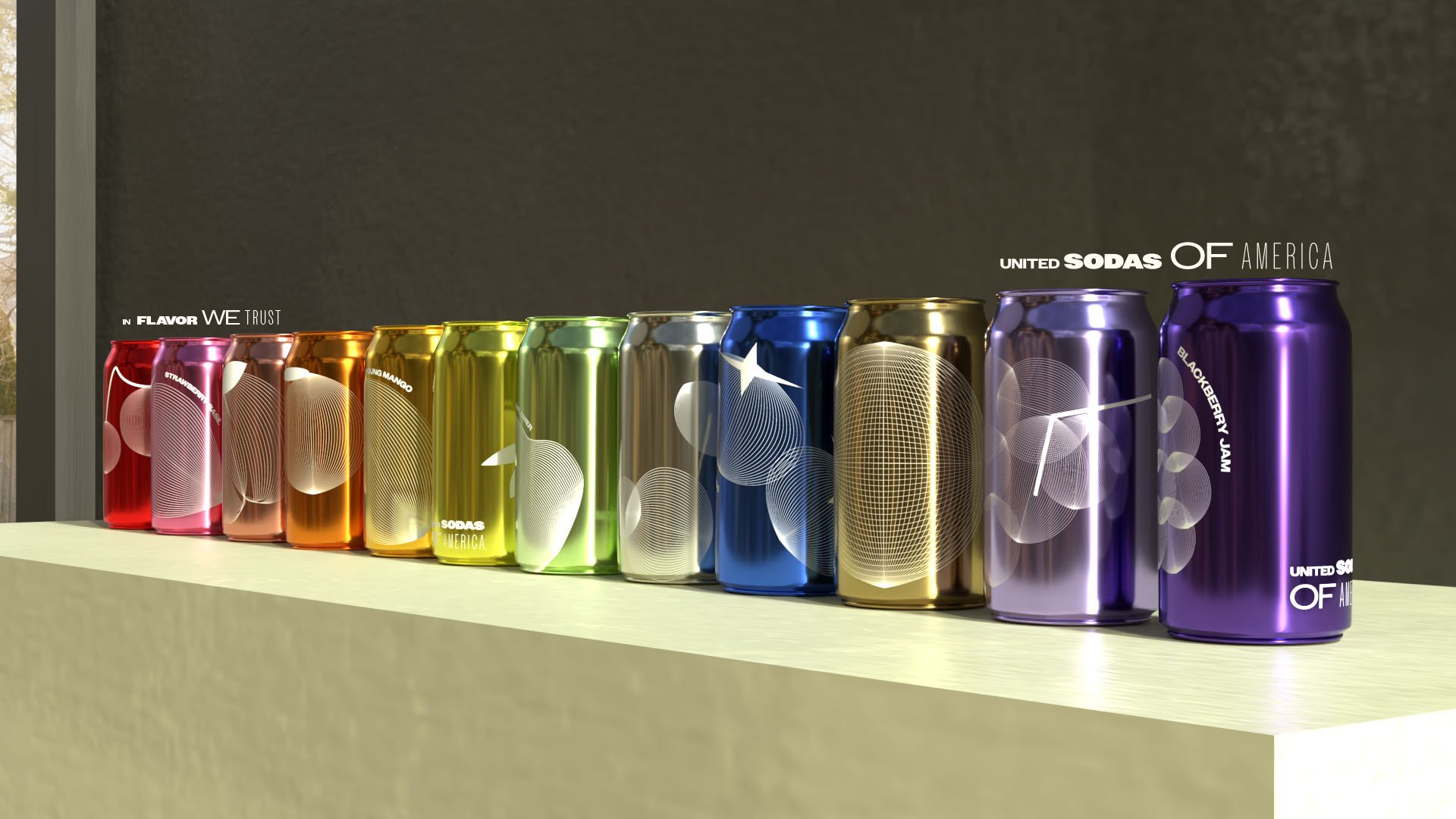
As a brand that just won a design award, I was left feeling a bit underwhelmed at the packaging design for these upscale sodas. While reworking it, I wanted to keep the same use of open, clean color, as well as the use of a strong grid and sans-serif typeface. However, I wanted to experiment by playing with lines, specifically when small lines interact when they overlap. I aimed to create a bit of an illusion in the packaging, while still keeping it clean and approachable. This project also included some 3D modeling, leaving us with these beautiful, metallic cans.
Programs used: Adobe illustrator, Adobe Dimension